Accessible local communication
Make essential business information easier for more people to use
Accessibility is not a decorative layer after a page is finished. A nearby customer may use a small screen, keyboard, screen reader, larger text or a different language. The useful test is whether they can still find the essential information and take the next step.
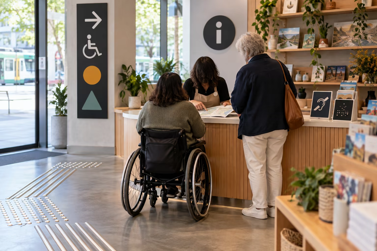
Put essentials in text
Write the business name, location, hours, contact method, price conditions and offer terms as readable page text. Do not put the only version of an important detail inside a graphic, poster or social image.
Use headings that describe the section and links that name their destination. ‘View current pickup details’ tells a customer more than ‘click here’.
Make actions clear without colour alone
A colour, icon or placement can support meaning, but should not be the only signal for an error, discount or required field. Label buttons and form fields directly, and show feedback in words.
Keep keyboard focus, tap targets and navigation order predictable. Test one key journey without a mouse and at a larger text size on a phone.
Describe useful images
For an image that helps a customer decide—an entrance, accessible parking or a product—write concise alternative text that states its purpose. Decorative images should not create noise for screen-reader users.
If the photo contains a price, date or condition, repeat that information in ordinary text beside it because an image can be unavailable, cropped or hard to read.
Use a short human check
Ask someone who did not create the page to locate the address, hours, contact option and one offer condition using a phone and keyboard. This is an early check, not a claim of formal accessibility conformance.
W3C notes that automated tools alone cannot determine whether a site is accessible. Keep the feedback route visible and improve the repeated barriers first.